Guest post by Kate at Climate Sight.
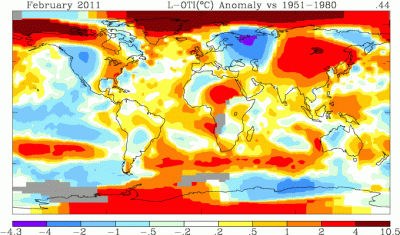
The Arctic is getting so warm in winter that James Hansen had to add a new colour to the standard legend – pink, which is even warmer than dark red:

The official NASA maps – the ones you can generate yourself – didn’t add this new colour, though. They simply extended the range of dark red on the legend to whatever the maximum anomaly is – in some cases, as much as 11.1C:


The legend goes up in small, smooth steps: a range of 0.3 C, 0.5 C, 1 C, 2 C. Then, suddenly, 6 or 7 C.
I’m sure this is a result of algorithms that haven’t been updated to accommodate such extreme anomalies. However, since very few people examine the legend beyond recognizing that red is warm and blue is cold, the current legend seems sort of misleading. Am I the only one who feels this way?


“They simply extended the range of dark red on the legend to whatever the maximum anomaly is – in some cases, as much as 11.1C:”
Hot Pink = “This amp goes to 11.” Spinal Tap